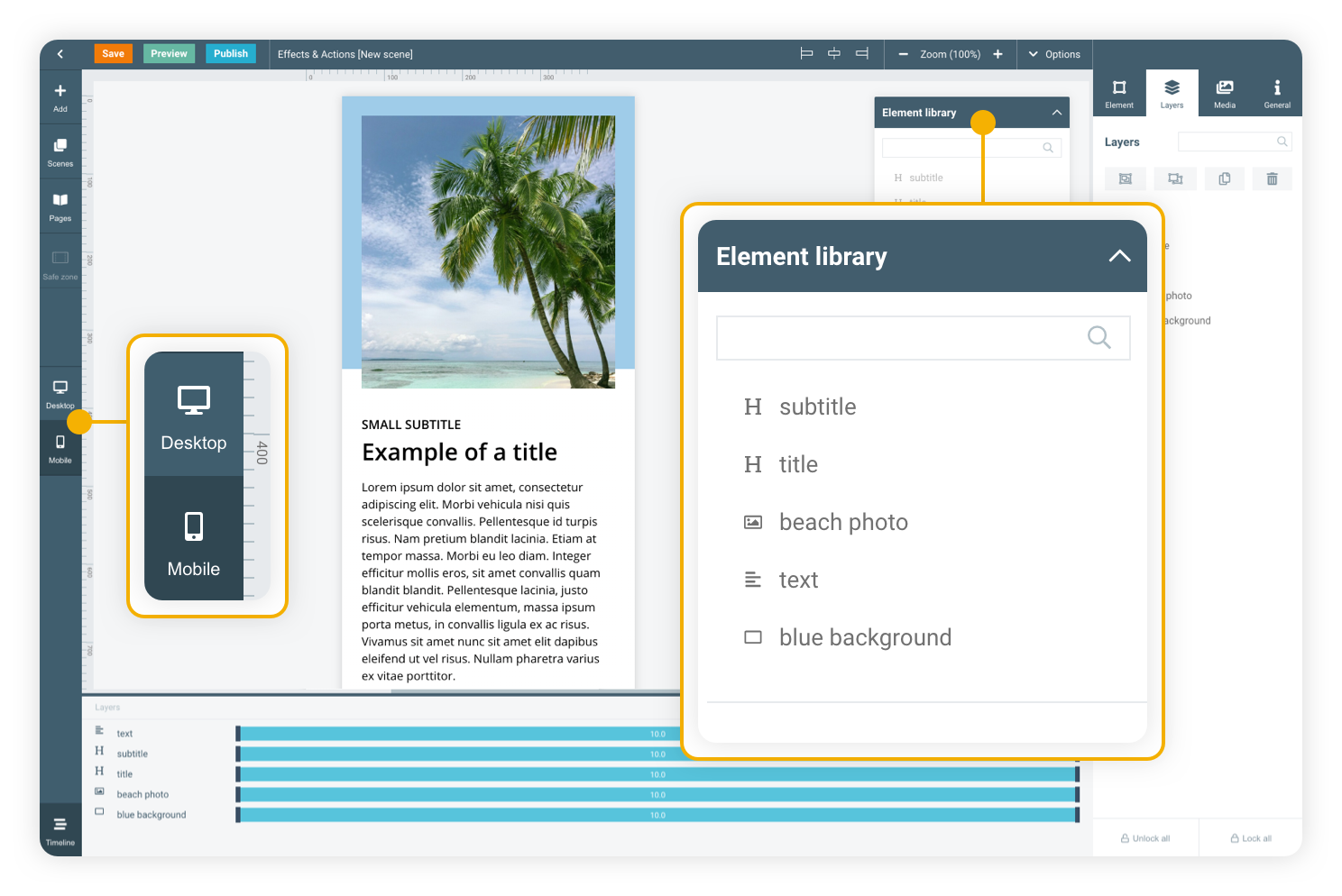
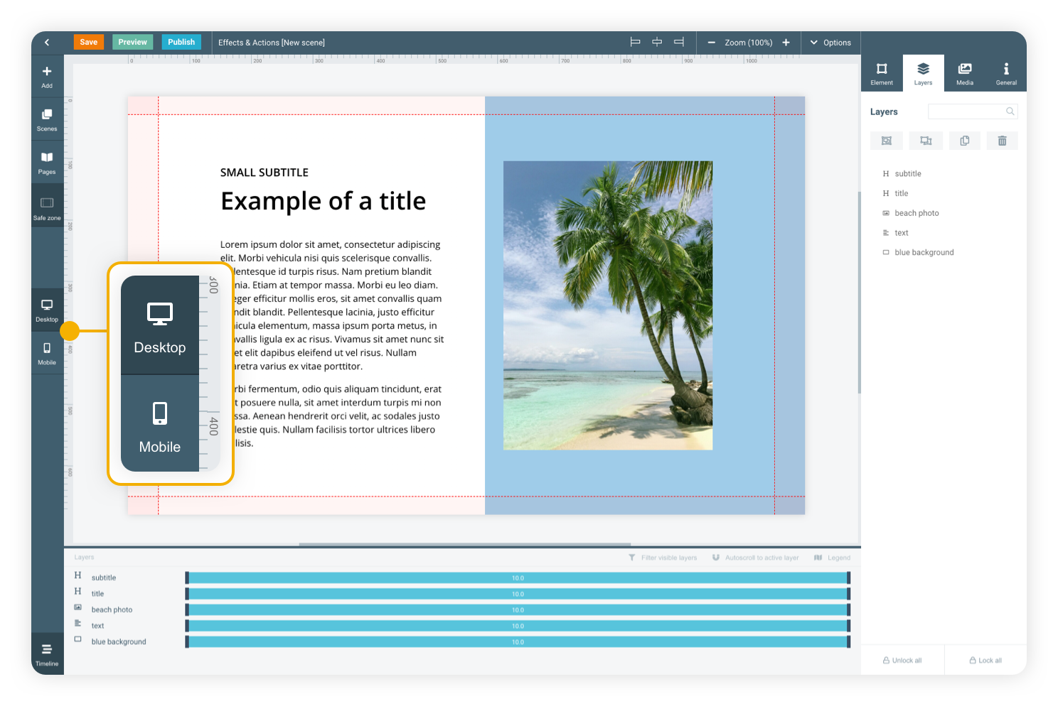
Desktop first
In Maglr Pro, your design always starts with a desktop (landscape) version. You can then translate the designed scene into a mobile version to make it fit on mobile (portrait) devices.
Element library
The element library will help you translate all used elements from desktop to mobile and keep them connected. This means that, when you edit an element on the desktop version, the mobile version will automatically update as well. Changes on mobile are done independently from the desktop version, so any changes you make on mobile will not be visible on the desktop version.
In Maglr Pro, you can edit and design the mobile version separately from the desktop version. Switch to the mobile editor of your scene to (re)arrange its elements in a way that is more suitable for mobile devices.
Mobile
BASIC TUTORIAL

Desktop version
PAGE WITH 3 POPUPS
Mobile has a smaller and more vertical screen compared to desktop. For that reason this mobile version has been rebuilt for an optimal reading experience.
Click here for a tutorial on how to create a popup.
Click the button to show ‘popup’ group

Scan the QR-code to view this page on your mobile device.


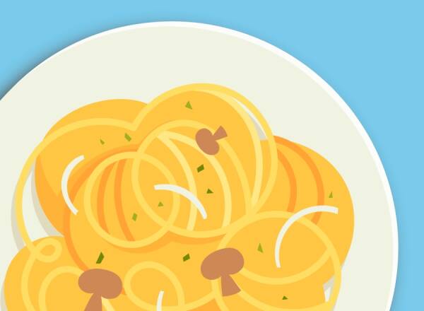
Dish 1


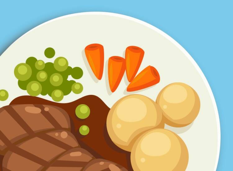
Dish 2
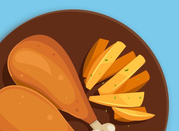
Dish 3
Go to the next basic course

In Maglr Pro, you can edit and design the mobile version separately from the desktop version. Switch to the mobile editor of your scene to (re)arrange its elements in a way that is more suitable for mobile devices.
Mobile
BASIC TUTORIAL
Mobile version
PAGE WITHOUT POPUPS
Mobile has a smaller resolution screen and is vertical orientated compared to desktop. For that reason a mobile version has to be rebuild for a optimal reading experience.
A tutorial on how to create a popup, see here
Proin aliquam ligula a nulla fringilla sagittis. Proin et dictum est. Nunc nec bibendum nibh, non tempor nulla.Donec tristique et nulla sed volutpat. Lorem ipsum dolor sit amet, consectetur adipiscing elit. Donec pellentesque auctor eros, eget cursus est. Proin aliquam ligula a nulla fringilla sagittis. Proin et dictum est.
Nunc nec bibendum nibh, non tempor nulla. Donec tristique et nulla sed volutpat. Lorem ipsum dolor sit amet, consectetur.
Dish 1

Dish 2
Proin aliquam ligula a nulla fringilla sagittis. Proin et dictum est. Nunc nec bibendum nibh, non tempor nulla.Donec tristique et nulla sed volutpat. Lorem ipsum dolor sit amet, consectetur adipiscing elit. Donec pellentesque auctor eros, eget cursus est. Proin aliquam ligula a nulla fringilla sagittis. Proin et dictum est.
Nunc nec bibendum nibh, non tempor nulla. Donec tristique et nulla sed volutpat. Lorem ipsum dolor sit amet, consectetur.

Dish 3
Proin aliquam ligula a nulla fringilla sagittis. Proin et dictum est. Nunc nec bibendum nibh, non tempor nulla.Donec tristique et nulla sed volutpat. Lorem ipsum dolor sit amet, consectetur adipiscing elit. Donec pellentesque auctor eros, eget cursus est. Proin aliquam ligula a nulla fringilla sagittis. Proin et dictum est.
Nunc nec bibendum nibh, non tempor nulla. Donec tristique et nulla sed volutpat. Lorem ipsum dolor sit amet, consectetur.